Bidding Farewell to the New Beetle (Design Critique)
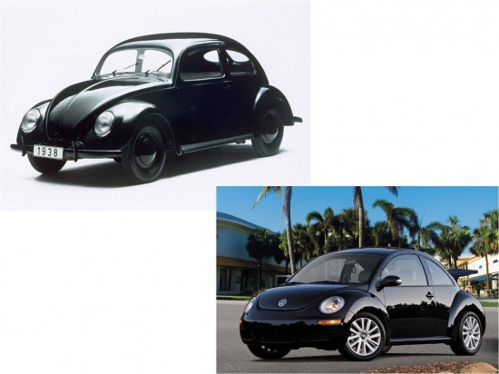
In 1994 VW showed a concept car that was immediately recognizable as drawing its inspiration from the vintage Beetle. Originally ‘dubbed the Concept One (pun intended), the car would be modified into the production New Beetle. While a successful design in many regards, this reborn Beetle failed to fully capture the spirit of the original. Now facing its final model year after 13 long years of production, the New Beetle looks as aged as any of its contemporaries from 1998.
Sources indicate that a ‘new’ New Beetle is coming. What can Volkswagen do to correct the deficiencies of this aged caricature of the legendary people’s car? More importantly, how can they design a car that appeals to both genders this time around? For some insight, a comparison of the original and neo versions of the car is warranted. The vintage Beetle in these photos are the “Ultima” final commemorative edition Beetles offered to the Mexican market where they were produced. The New Beetle is a 2010 model, with the light blue car appropriately equipped with the ‘final edition’ trim level.
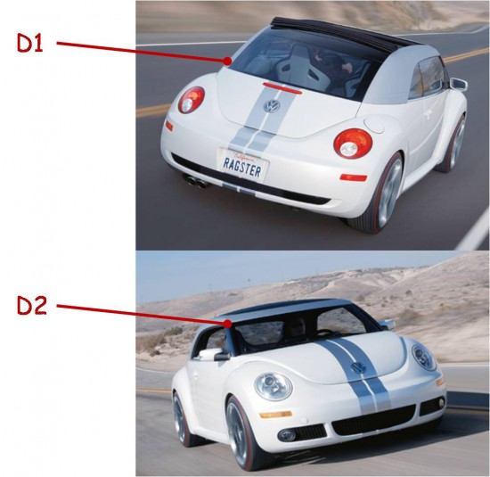
While the next New Beetle doesn’t need to follow every last detail of the vintage Beetle, paying close attention to the proportions of the car should make the next iteration a bit more timeless than the design we have lived with for over a dozen years. A flatter overall roofline is rumored for the next car, along the lines of the Ragster Beetle concept. So let’s take a look at which details might help carry the spirit of the Beetle forward.
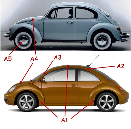
A1 – One of the biggest flaws in the New Beetle design was attempting to create a profile out of three half circles; roof, front fender, and rear fender. This was clearly not the design theme of the original car and creates a cartoonish look rather than the cleverly streamlined elements of the original.
A2 – The continuous arch of the roof is not only unrepresentative of the original, but also results in a ridiculously high roof.
A3 – Roof design also forced the A-pillar too far forward, so much so that it is a challenge to tell which end of the car is coming or going in profile. The A-pillar also forced the front door cut-line into the front fender – inelegant indeed.
A4 – How is it that the rear-engine car has a longer hood than the front engine car? The stubby nose again gives this car a cute look.
A5 – Simple chrome wheel covers on painted steel rims will never go out of style regardless of various modern trends. Restricting the white walls to the vintage Beetle might be wise.
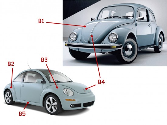
B1 – VW missed the opportunity to recreate some of the basic Beetle styling cues by choosing not to replicate the embossed pattern on the hood of the new car. At least the separate fenders were transferred largely intact.
B2 – Fender-line creases were introduced mid product cycle on the New Beetle. These actually succeeded at updating the design while, at the same time, making the look similar to the original fenders.
B3 – Wouldn’t it have been great to have mounted the turn signals on top of the fenders? This is something that the original Beetle only offered for a time, but were memorable and tremendously functional. One could speculate that fender mounted signals would be able to double as Euro-spec side marker lights.
B4 – Beetle logo moved from the top of the hood to front and center. This seems appropriate despite the fact that the Wolfsburg crest took that location on the original car along with the hood handle.
B5 – False running boards are another successful cue transferred from old to new.
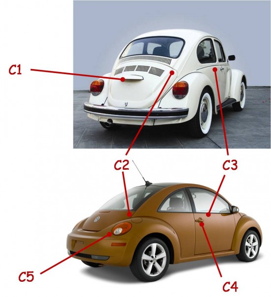
C1 – Another missed opportunity was the familiar license plate bracket centered in the deck-lid/engine cover.
C2 – The continuous flow of the roofline into the deck-lid was missed on the new car resulting in a tiny lower hatch piece and a huge rear window. Again, the disproportionately high roof dictated such deviations from the original.
C3 – This chrome piece emphasizes the downward arc of the beltline, yet another detail that is missing on the original.
C4 – Door handle, though lacking chrome, is a true reference to the vintage car: a simple scallop behind a pull bar
C5 – Tail lights are one of the successful features inspired by later iterations of the original car. The lights on the vintage car cleverly incorporated all the necessary rear lighting. The resultant protruding lights were often referred to as ‘elephant’s feet’. In a strange case of the old influencing the new influencing the old, the New Beetle tail lights were so well done that the aftermarket began producing similar lights for the vintage Beetle in Mexico.
D1 – Chopped roofline of Ragster concept actually succeeds in making the New Beetle both more masculine and nostalgic.
D2 – Abbreviated windshield height gives the appearance of flat glass, again relating the design back to the original car more accurately than the production New Beetle.


My cousin recommended this blog and she was totally right keep up the fantastic work!