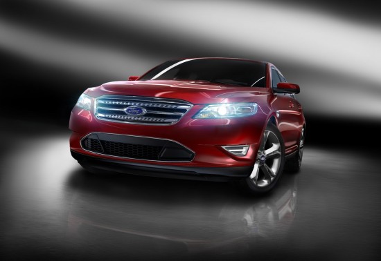
2010 Ford Taurus (Design Critique)
Since the mid-1990s rumors of the demise of the Ford Crown Victoria and Mercury Grand Marquis twins have perpetuated through the automotive press. GM’s relatively unexpected discontinuation of the Caprice in 1996 gave extra boost to the Crown Vic’s sales. Unfortunately, with no competition Ford’s Panther platform soldiered on year after year with changes that were often transparent to their aging target audience.
When Chrysler challenged Ford’s rear-wheel-drive land yachts with the 300, Magnum, and Charger starting in 2004 the days of the Crown Vic seemed to be numbered. Ford had been readying a large car of its own but cops, cabbies, and the elderly were aghast that it was not only bland to the eye but also saddled with front-wheel-drive. The car came to market as the Five Hundred and the automotive press responded with a yawn. Ford appeared to recognize its mistake and debuted a stunning rear-wheel-drive concept in 2007 dubbed ‘Interceptor.’ This seemed to be an indication that Ford was re-thinking the demise of the Crown Vic since the police package of that car was also marketed as the Interceptor.
Meanwhile back at the offices in Dearborn, Alan Mullaly was appointed as Ford CEO to save the confused corporation from its downward spiral. Wondering why the once legendary Taurus name had been dumped in favor of Fusion and Five Hundred, the revised Five Hundred was renamed ‘Taurus’ for 2008. Fortunately, a new Taurus was being prepared for 2010 and the Crown Victoria, which had been fleet-only for a couple of model years, was planned to be quietly terminated by 2011.
So what does all this mundane large-car history have to do with the design of the 2010 Taurus? Quite a bit, actually. You see, the design of the Taurus is relevant in relation to the Crown Victoria in that it will have to satisfy traditional car buyers, police fleets, and those who have outgrown a Fusion. Also, the 2010 Taurus clearly owes many of its styling elements to the 2007 Interceptor Concept. So let’s take a look at what Ford did right in order to salvage the unloved 2005-2009 Five Hundred and Taurus and see where this car falls short as a proper Crown Victoria successor.
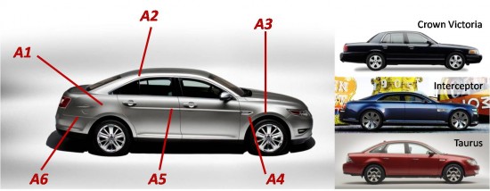
A1 – Taurus has an unfortunate amount of excess side height when compared to the Interceptor and ‘Vic.
A2 – Greenhouse is clearly inspired by the Interceptor concept.
A3 – Though not entirely visible from this angle, the front wheel is positioned too far rearward and the front overhang is quite large. It seems that Ford photographers have recognized this is a bad angle for the car and refuse to photograph it from a pure profile perspective, unlike the stunning Interceptor and stately Crown Vic.
A4 – Side vent looks to be lifted right off the ‘08 Taurus.
A5 – Character line is a nice delicate touch to a relatively bulky looking car. It gets interrupted by the rear fender and bravely intersects the fuel filler door.
A6 – Rear cut line actually seems to enhance the rakish look of the side profile.
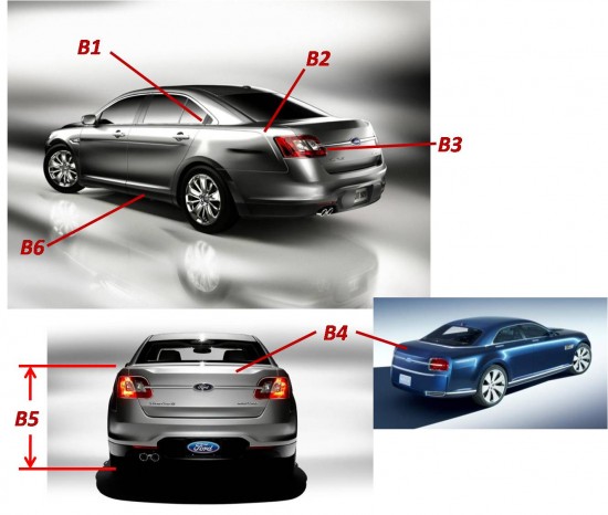
B1 – For the first time in history the Taurus abandons the 6-window green house; quite a shame considering the triangular side glass doesn’t work with the stubby looking rear doors which forces the chrome outline to frame a ‘dummy’ plastic triangle.
B2 – Not sure what this hockey stick crease is intending to do. Perhaps it was intended to frame the rear face of the car with further definition.
B3 – Tail lights are clearly inspired by the Interceptor but, unfortunately, are asymmetrically shaped and interrupted by the deck lid opening.
B4 – Trunk shape is a unique look for the Taurus and sets it apart. This is one of the few styling elements successfully applied from the Interceptor.
B5 – Rear deck lid is awkwardly tall in stark contrast to that on the Victoria.
B6 – Black lower rocker panels are necessary to hide the Taurus’ absolute bulk.
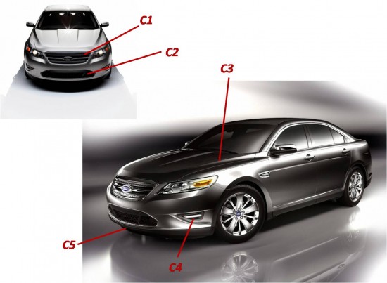
C1 – Front view of the car is the one original and successful design element for the Taurus. Grille is a unique reinterpretation of the fairly recent three-blade Fusion look.
C2 – Lower intake smartly copied from European Ford designs that will make their way to these shores shortly as the Focus and Fiesta.
C3 – Hood shape is well defined and good looking from this angle. Too bad it isn’t applied to a longer hood.
C4 – These can’t possibly be functional fog lights as they appear to point to the curbs.
C5 – Large overhang appears pronounced from this angle.
The Bottom Line: Ford proves the Taurus and Crown Victoria were too disparate of nameplates to replace with a single car, but close attention to details creates a compelling large Taurus.


[…] Visit link: Automotive Trends » 2010 Ford Taurus (Design Critique) […]
found your site on del.icio.us today and really liked it.. i bookmarked it and will be back to check it out some more later
well written blog. Im glad that I could find more info on this. thanks
Wow this is a great resource.. I’m enjoying it.. good article
Terrific work! This is the type of information that should be shared around the web. Shame on the search engines for not positioning this post higher!