2004 Pontiac GTO vs. Holden Monaro (Design Critique)
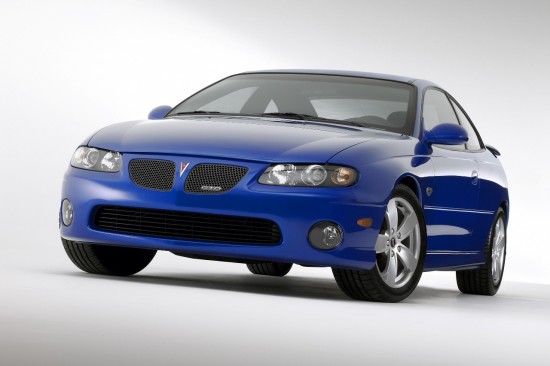
With the introduction of the Holden Commodore Concept Coupe at the turn of the millennium, it looked as if the designers at Holden had found a way to breathe some new life into GM’s slowly aging RWD midsize platform. By merely changing the roofline and stretching the front doors, the conservative sedan was transformed into an attractive coupe. The design cleverly used the sedan’s decklid, hiding the upright flare at the leading edge with its rakish extended c-pillars. Fortunately, Holden found a way to put this car into production as the revived Australian legend Monaro coupe. One of the first projects Bob Lutz spearheaded upon his appointment at GM was to get this car on sale in the United States. What better brand to give it to than Pontiac, and what better nameplate to revive a midsize muscle coupe than the GTO. The ‘purists’ bemoaned its plain looks, but these must have short memories as the GTO was never more than a performance version of the ordinary Tempest and LeMans. While many concessions were made in the conversion, such as a trunk robbing fuel tank, and some right hand drive specific components, the outcome was likely better than Pontiac would have established on its own. The analysis of the design of one of these hallowed nameplates demands that of the other; so here they are in a literal side by side comparison.
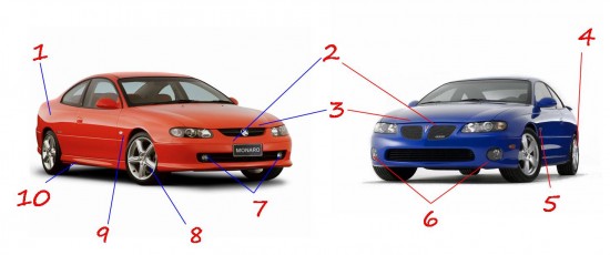
- Large expanse of rear quarter sheetmetal. This should look bland, but is shaped just right to give an aggressive look.
- Front fascia is a bit plain. Holden relies on badges to reveal brand identity. The Pontiac has the benefit of the brand’s split honeycomb grille and a nice centerline to it.
- Hood cut line a bit large on GTO – hidden by grille on Monaro.
- Aggressive rims that are available in 17” or 18” with the same look. Surely these are shared with some version or another of the Monaro.
- Classic triangular fender badge replaces the Australian model’s repeater lens. This one says 5.7L, inevitably leading ’04 owners to want to ‘trade up’ to the 6.0L for ‘05.
- Fog lights out at the corners. Larger grille-intake gives GTO a more aggressive and stylish look.
- Fog lights barely noticeable; mounted inboard amongst the lower grille-intake
- Rims are a bit delicate looking, and not shared with the GTO.
- Repeater lens uninterestingly placed on the front fender – the next generation Holdens do much better by integrating this into a Buick-style fender-vent
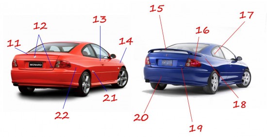
- Lower rocker extensions dress up what is now an old design.
- Standard Monaro has a clean rear deck-lid with sculpted trailing edge
- Monaro makes do with only a Holden emblem and cv8 badge on the trunk. Apparently Holden felt the side badging was enough. Does Monaro have the same amount of model-name identity in Australia as the GTO in America? – no Holden nameplates are present
- Door cut-line is curiously arced forward as on the sedans. Typically coupes reverse this cut-line due to the lack of a need to clear the rear doors. And yet, this does nothing to detract from the well-proportioned styling – perhaps it even enhances it.
- RWD platform is emphasized with an appropriately long distance from the front wheel centerline to the windshield base. Can you say BMW?
- GTO inevitably gets North American style spoiler. Though it blocks rearward visibility significantly, one must admit that it lends to the sporty look of the GTO vs. the Monaro. Shame on the redundant CHMSL!
- Red tail-lights with disguised amber turn signals are shared between both cars. Looks good and clean.
- Rakish roofline and rear quarter window upsweep have transformed the Commodore/Omega/Catera sedan into something completely different and more attractive.
- Fuel filler repositioned to top of fender – a location usually reserved for more exotic cars. Looks good and seems to reduce the chance of over-fill spills due to the nozzle always being in the ‘down’ position during pumping. Its also nice to not be pumping gas at knee-level. We all know the real reason is the relocation of the fuel tank to the trunk to meet U.S. crash standards. Too bad the door is on the passenger side.
- Decklid badging identifies the GTO and it’s engine clearly – yet no Pontiac name is anywhere on the car. Arrowhead emblems do the job sufficiently, and who doesn’t know that a GTO is a Pontiac?
- Both cars feature the ‘90’s BMW 7-series style rear bumper – lots of un-styled plastic. Rear bumper would later feature a contrasting ‘GTO’ imprinted panel.
- Monaro script located in unusual – but attractive – spot, drawing attention to the coupe-unique nameplate – much in the same fashion as the Chevrolet Monte Carlo
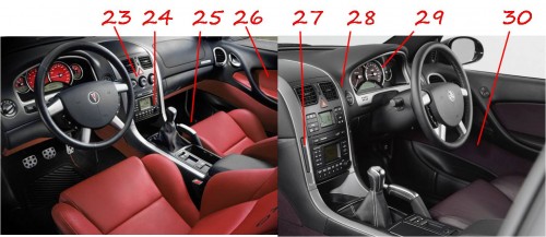
- Lower position for fuel filler – shared location with platform-mate Cadillac Catera. In its home market, this is on the correct (driver’s) side

- The Monaro offers a complex climate control system, whereas the GTO makes do with simple knobs – and is probably better off for it.
- The radio controls are carried over without change from the right hand to left hand conversion, meaning that GTO owners have a long reach to the more commonly used controls which are sometimes obstructed by the shifter.
- The parking brake didn’t make a move either, meaning that GTO owners have a long-ish reach around the shifter.
- Contrasting stitching and color-coordinated interiors add flair to a potentially reserved design.
- The Holden gets a pair of SAAB 95 style cupholders. The Pontiac receives low-tech console cupholders instead. When in use, taller beverage containers hinder access to the shifter.
- Nice metal accents around center stack.
- Only four gauges on the instrument cluster is a curious decision in a performance car – an ampmeter and oil pressure gauge would be much appreciated, especially as the car ages.
- Suede door inserts that extend to the dash-panel are a pleasant touch.


GTO IS THE BEST DESIGN CAR
As old as this is, I wish I discovered it earlier. You’re comparing two different models of Monaro and GTO. The GTO America received is the VY equivalent. You’re comparing the V2 Monaro to the VY Monaro. Stupidest comparison ever. Lastly. Why does it need an ampmeter? Do you Americans like more useless gauges? “Woohoo, I can see how much charge my battery has, and how well the alternator is working!!”
Does the Corvettes have these silly gauge additions?