2007 Holden Caprice (Design Critique)
Caprice. The name evokes various reactions. To some it is merely an outdated Chevrolet for the elderly. Others think of a car that they envisioned as ugly and overweight. And yet to many the name is a legend; a name revered.
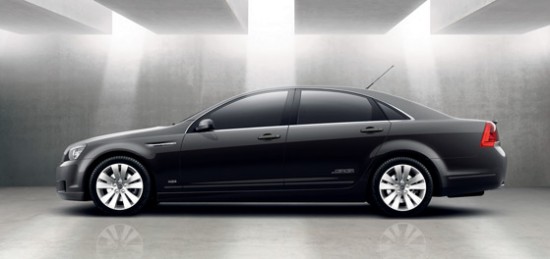
Not in the same way as a Corvette, Mustang, or Mercedes Gull-wing is revered but rather, as a faithful, reliable, powerful, and comfortable car. While the last Chevrolet Caprice rolled off the assembly line in Arlington Texas some ten years ago, Holden has been producing a car by the same name continuously since that time. Bearing little cosmetic resemblance to Caprices of America’s past, the Australian Caprice has had some distinct similarities. Both are rear-wheel drive cars powered by a traditional push-rod V8 engine. While typically more conservative in design than the Chevrolet Caprice, the Holden has been an executive’s car. With Holden’s latest iteration, one must wonder if GM would be wise in returning the hallowed Caprice name to the United States. The current iteration is a nice blend of contemporary styling featuring a short front overhang and a wonderfully long hood. Side vents give an impression of class, not unlike the Cadillac Sixteen concept. There is nothing retro about the design. In fact, the car seems well proportioned from any angle. The wheels appropriately fill out their openings. This was once how the BMW 7-series could be described. The long rear doors combined with the rearward set windshield give an impression of wealth, unlike many of the inelegant stocky looking luxury cars of today, including the likes of the VW group’s VW Phaeton, Bentley Continental, Audi A8; Acura’s RL; Jaguar’s X-Type; and Lexus’ ES. While forgoing six-passenger comfort we must recognize that a central front seating position has been made obsolete by relegating children back seat for safety precautions. This car could be sold in the US as a Chevrolet Caprice/Imapala/Bel-Air/fill-in-the-blank-traditional-Chevy-name and fill a void between the classic styling of the Chrysler products and the decade-and-a-half old Crown Victoria, not to mention the tremendously plain Five Hundred/Montego twins. Combine this with a Super Sport option and GM might just have the next home run of the industry. If nothing else this would make a better contemporary Buick than the Lucerne and Lacrosse – perhaps a revived Roadmaster or LeSabre? It already has space for the ventiports.
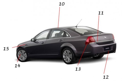
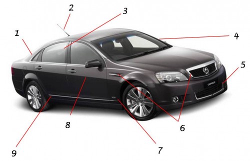
- D-pillar elegantly fans from narrow to wide and transitions nicely into the trunk.
- Angled central antenna, a trend initiated by VW, is hardly discreet and but allows the feature be part of the styling, rather than a mere add-on.
- The green-house from certain angles has a bit of Audi to it. Not too original, but good looking.
- A-pillars are pleasantly thin for a modern car, and yet give an impression of strength
- Deep front spoiler with chrome trimmed grille balances the elegant with the sporty.
- Nice use of bright-work on the grille surround and side vent.
- V8 badge is a nice subtle hint to what lurks beneath the hood.
- Gentle fenderline crease gives definition to a fairly plain side. It drops as it approaches the front of the car, giving the car a low looking stance.
- Audi-like lower rocker flair adds some visual interest to otherwise clean sides.

- Just the right amount of chrome surrounding the windows is a nice detail.
- Chrome strip on trunk gives just the right touch of bright-work, and integrates well with the reverse lights.
- License plate location joins the current trend away from a prominent trunk mounted unit advertised by a chrome bracket.
- Simple triangular tail-lights lack distinction, but are similar to those on the Chevrolet Impala.
- Large wheels have a unique design. Not overly pretty, but are aggressive looking.
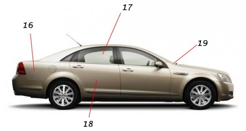
- Side vent adds style and fills in the large space between wheel opening and leading edge of door. It also leaves plenty of options for trim variations.

- Larger than typical rear overhang is a nice departure from the current trend of stubby trunks. However, the short deck-lid is necessitated by the rake of the rear window.
- Six window greenhouse would be appropriate on a large Chevrolet.
- Long rear door hints at plentiful rear legroom.
- Windshield base sets far behind front axle – very good looking proportion, and probably aids in weight distribution.


