2010 Buick LaCrosse (Design Critique)
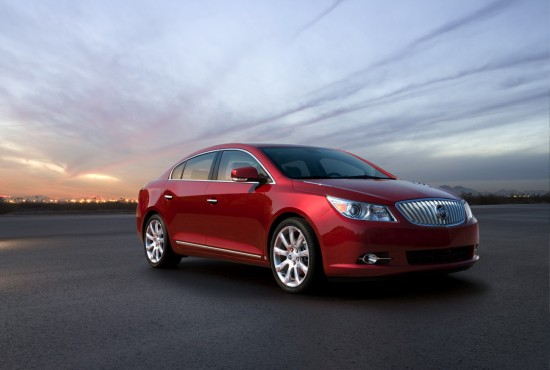
The new Buick LaCrosse is such a fresh departure from the w-car based model that introduced the nameplate that we felt a Design Critique was in order. That car looked old from the beginning, and worse, bore a large resemblance to the then-current Ford Taurus from nearly any angle. This new ‘Epsilon II’ Buick’s shape is familiar since many front-wheel-drive cars have been morphing into what nearly looks like a one-box design. However, the details happily prevent this car from looking like a Cam-cord with Buick emblems.
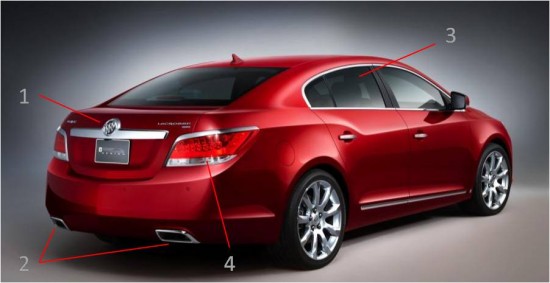
(1) Prominent license-plate bracket is bold touch and is a design trend that has all but disappeared on most cars.
(2) Neatly integrated dual exhausts help differentiate the car from lesser mid-size sedans
(3) Green-house well shaped, but hardly original. What if the lower window edge paralleled the dip in the sweep-spear (8)?
(4) If there is one complaint with the rear of the car, it is that the taillights look very much like those on the BMW 5-series , though the chrome trim is appropriate.
(5) Sadly, the front overhang is quite large. However, this is after all a front wheel drive car, so looking like one is not all bad. Though large, the overhang is well shaped with a nice lower lip near the bottom edge.
(6) Multi-spoke wheels give similar impression as those on the upper-level Malibu. Thankfully, no five-spokes here.
(7) Repeater lights are well placed in the mirrors.
(8) Buick sweep-spear is a brilliant interpretation of a design cue from Buick’s glory days. Rear ¾ view looks both elegant and aggressive.
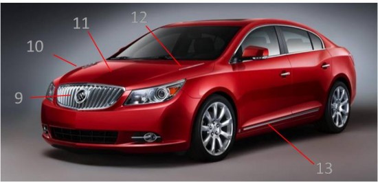
(9) Converging bars in the grille make a nice variation on the toothy-Buick look. The bars are done just right – any greater angle would look too contrived, any less would look too derivative.
(10) Creases on the hood allow for creative placement of venti-ports and reminds one of the breathtaking final production Riviera.
(11) Nice parting line down the center of the hood is also repeated on the lower deck-lid and fascia.
(12) The venti-ports are facing the sky. A nice subtle touch that was attempted on several concepts before finally making it to production. Thankfully, there are an appropriate number of six holes total.
(13) Dash of chrome on rocker panel is better integrated than on Malibu, but seems to be a common design theme that may be repeated on future GM products. It is neatly punctuated by the GM badge on the (very short) front rocker panel.


