2011 Jeep Grand Cherokee (Design Critique)
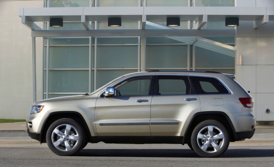
For 2011 Chrysler wisely decided not to let it’s Jeep Grand Cherokee, the flagship of its legendary off-road brand, get stale. This marks the fourth generation of the model, which took over the place of the ancient Grand Wagoneer after its departure in 1991. The Grand Cherokee has never strayed far from its original design cues and 2011 model is no exception. However, the new SUV has enough clever styling touches to advance the model without losing the vehicle’s desirable familiarity. This is likely a good move, as the Grand Cherokee’s main rivals have slowly dropped out of the market (TrailBlazer and Envoy) or are planned to move to car based platforms (Explorer) – Chrysler may find it has this traditional mid-size trail-rated market largely to itself. Or, more pessimistically, will the Grand Cherokee find itself in a market that the industry now finds irrelevant? Whatever the case this vehicle appears strong enough in its design to hold it’s own niche in an ever changing marketplace.
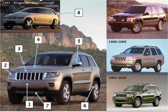
(1) Presumably faux skid plate at the bottom edge of the front fascia.
(2) Three variously sized bulbs have jewel like details.
(3) ‘Jeep’ lettering ensures brand recognition, even if the trademark seven slot grille didn’t give it away.
(4) Recessed panel in the hood breaks up an otherwise flat panel.
(5) Wow, there’s a lot of chrome on this mirror, at least for a Jeep.
(6) Attractive wide, muscular stance implies good off and on road stability.
(7) Front fascia has an unfortunate gentle scallop to accommodate a front license plate. When will the remaining states free our cars from this front end blemish?
(8) The overall shape of this vehicle is preceded, and perhaps predicted, by the Wagoneer 2000 concept from 1991. Though that 20 year old conecept lacks the now requisite vertically slotted grille, the rear-most portion of the greenhouse is particularly similar to the current Jeep flagship.
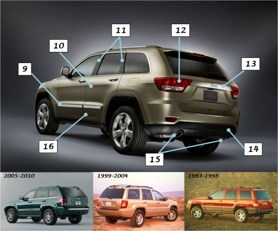
(9) Large ‘Grand Cherokee’ lettering declares the model name, but is difficult to read as it is stamped into the massive chrome rocker panel trim.
(10) Character line gives a fluidly muscular look to what is expected to be a fully capable off roader.
(11) Black ‘b’ and ‘c’ pillars finally achieve a fully congruent look to the side glass and yet successfully retain the upright look of the greenhouse.
(12) Tail lights unexpectedly intrude into the rear hatch opening as all three previous generations of the vehicle had uninterrupted freestanding units.
(13) Chrome accent connects the tail lights and also creates a trapezoidal license plate frame that appears to be large enough for a European sized plate for export markets.
(14) Contrasting black lower rocker panels and lower fascia are nice detail touches and successfully hide the bulk of the rear bumper.
(15) Dual exhausts indicates that, yes, this does indeed have a Hemi, and not it’s new base V6 ‘Pentastar’ 3.6L.
(16) Upper rocker panel shape reminisces of the gray body cladding the early Grand Cherokees used as does the flat faced trapezoidal wheel arches.
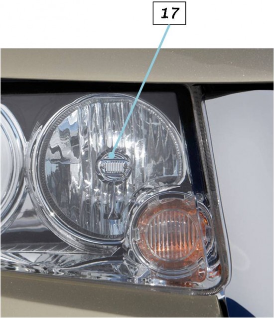
(17) No one can accuse Jeep of glossing over details. Note the Wrangler-like grille and headlamps embossed in the center of the headlight filament.


