2014 Chevrolet Corvette Stingray Design Critique
January 14th, 2013
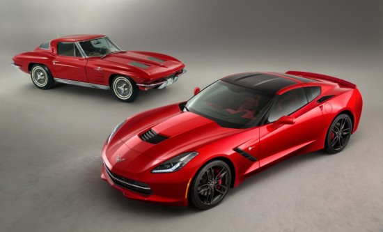
We’ve never been given the task to design a car, much less one as sacred to the automotive faithful as the long running Chevrolet Corvette. The look of such a car must be a challenge to the designers in order to balance the continuation of the legend while reinventing and innovating to keep the car fresh and competitive. It is much easier for those of us on this side of the drawing board to praise or criticize each generation of Corvette. At the end, however, it is the consumer and enthusiast who decides the success and failure of each successive automotive generation. We’re critics though and we know what we like and we know Corvette history. Unfortunately this new car, which revives the Stingray name, did not immediately take our breath away. Even so we must remember our original thoughts when casting our gaze on the C5 Corvette, which is now considered the car that revolutionized what it meant to bear the beloved name. That car didn’t immediately strike us as beautiful then either. Certainly we can praise the upgraded interior and speculate on what it will feel like to row through seven gears. What we can’t predict is whether the C7 will grow better with age or be remembered as the car that broke the Corvette’s beauty streak.
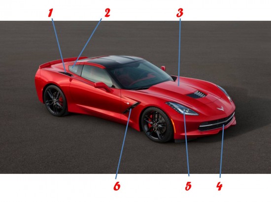
1. Rear fender vents presumably feed air for cooling the rear brakes – certainly a new design feature for the Corvette rather than rocker panel vents on the C5 and C6.
2. Greenhouse design is the largest departure from historic Corvette design: never before has the car featured a quarter window. While it may be ok to break with tradition this side glass design is neither creative nor beautiful.
3. Hood shape evokes that of the C6 ZR1 but forgoes that car’s gimmicky glass hood
4. Low and wide grille is a familiar feature developed from the C6. A splice of chrome along with widely spaced grille bars are a nice throw back to the C1 Corvettes of the 1950s.
5. Exposed headlights debuted for the first time since ‘62 on the 2005 C6 Corvette. These new units follow the current industry trend to stretch back down hood.
6. Side gills continue as part of the Corvette tradition; these are neither groundbreaking nor overly pretty.

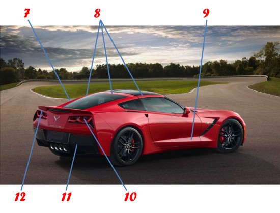
7. Departing from the long running convex rear window the mildly buttressed and tapering rear glass is a good looking feature. Too bad it is supported by a thoughtlessly shaped quarter window that looks far too much like a Nissan GT-R or any one of a number of recent Ferraris.
8. Tapering rear glass and quarter window combination demand that the body color now continue to the A-pillar. Combined with the black roof section and horizontal body color, what once was a flawless Corvette trademark has now been reduced to a confusion of color and shapes.
9. Doors are deeply sculpted and nicely accented with sharp edges.
10. Round tail lights have been successfully reinterpreted into rhomboid shapes.
11. Large black valence is likely intended to minimize the visual bulk of the Corvette’s rear panel but ends up looking like far too much low grade plastic.
12. Tacked on spoiler is an unexpected feature. Corvettes have typically been known for their clean rear design which is a tradition the C7 fails to carry out.

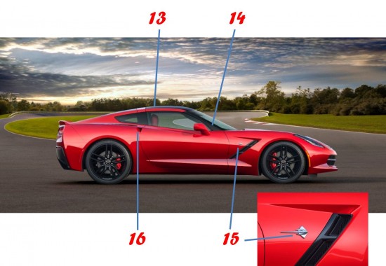
13. Profile is familiar but the busy design is not.
14. A-pillar is sharply cut off by the horizontal body color above the side glass, leaving the blacked out portions of the greenhouse touching oddly at a single point.
15. Stingray emblem is perhaps the most pleasing design element on the entire car: It is a beautiful piece of automotive jewelry.
16. Finger activated door release carries over form the C6.

Categories: Auto Shows, Design Critique, Miscellaneous, Video 2014, C7, Chevrolet, Corvette, NAIAS, Stingray, V8


