2010 Buick Regal GS Concept (Design Critique)
The revival of the Buick Regal name is surprising, largely in that it seems like the model name has been gone for only a couple model years. In fact, the Regal was last used on Buick’s version of the w-car platform in 2004. It was a buckets and console version of the mild Buick Century. The new car is a departure for Buick in that it will offer no V6 and a choice of manual or automatic 6 speed transmissions. Buick is marketing the LaCrosse as a Lexus competitor. If that is the case, this car seems to take aim at the Acura TSX – at least in powertrain configurations. Based heavily on the Opel Insignia, the car was thought to be planned as the replacement for the Saturn Aura. Since the Saturn experiment has now been terminated and Pontiac eliminated, the time was right for Buick to offer such an agile small sedan.
The 2010 Buick Regal GS concept seems to pick up where Pontiac left off. A manual transmission, all wheel drive, Recaro seats, and Brembo brakes make one wonder if Buick might steal Oldsmobile’s infamous tagline and use it for their own. ‘THIS IS NOT YOUR FATHER’S BUICK’. And soon Buick might be able to legitimately ask the question ‘Wouldn’t you rather have a Buick.’ I sure would!
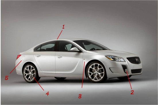
(1) Arching roofline gives a nice coupe-like roof. Very different from the classic Regals of the 1980’s.
(2) Vertical intake-like openings are becoming an intriguing industry trend. Just look at recent Aston Martin designs, not to mention GM’s own Stingray concept form 2009. These are beautifully trimmed and would nicely differentiate the GS from the mainline Regal.
(3) Side marker lamp is unusual in that it really isn’t integrated into the design of the car, other than its appropriate placement in line with the character line in the front door.
(4) Wheels look like nice imitations of those on the Cadillac CTS-V and defunct Pontiac G8 GXP – a refreshing departure from the expected 5-spoke wheel.
(5) European heritage obvious from fuel filler placed on the wrong (passenger) side.
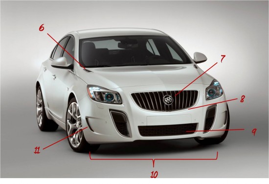
(6) Traditional Buick ventiports lie flat on the hood. The standard production car doesn’t get any such Buick trademark. These, however, sport two holes each; appropriate for a 4 cylinder!
(7) Buick emblem still monochrome – as it has been in the US for well over a decade. Chinese-market Buicks get classic Red-White-and-Blue tri-shield logos; here’s hoping they eventually make it stateside.
(8) Shield shape of grille was first seen on the Buick Velite concept that was only partially realized in the plain looking Lucerne sedan. Here it is a quite successful attempt at transforming an Opel in to a Buick.
(9) Multiple openings in fascia all have different textures creating a mildly confused look.
(10) Stance of the Regal GS makes this car look like it is as road-capable as an Audi.
(11) Horizontal intake (presumably for brake cooling) looks to be redundant with the front intake and is at odds with the vertical look. Couldn’t one of these openings serve a dual function – or is one of these purely cosmetic?
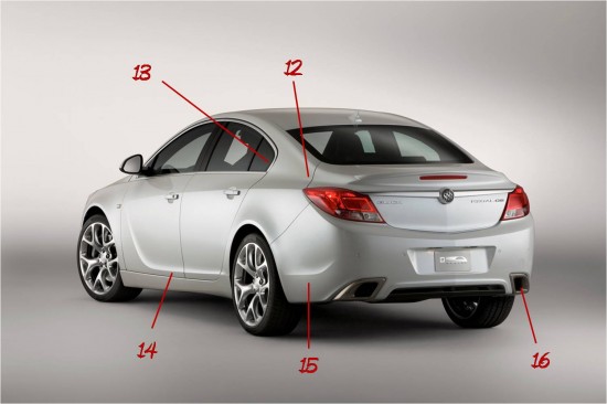
(12) Rear quarter panel is shaped nicely, but unfortunately does nothing to distinguish this car as a Buick. Copying the BMW 5-series has been done by just about every manufacturer these days, save Cadillac.
(13) Ditto for the dogleg rear window.
(14) This side sculpt, like the deck lid/rear fender form seems to invoke thoughts of BMWs. But, former GM chief of design once said about the Cadillac Seville ‘if you are going to steal, steal from a bank, not from a grocery store.’ Buick could have copied lesser cars…
(15) Lower character line continues through to rear bumper and gives it a nice definition.
(16) Exhaust is nicely integrated into rear fascia.


