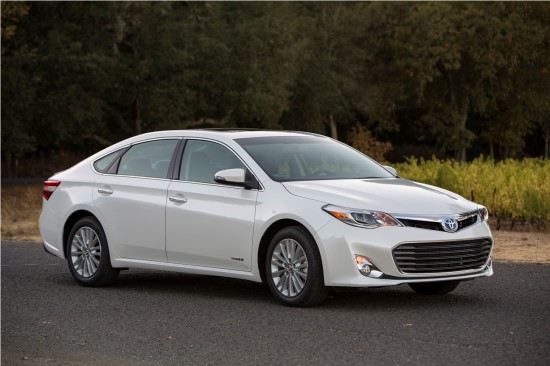
2013 Toyota Avalon Design Critique
The Toyota Avalon has been with us for much longer than seems possible. When it debuted as a 1995 model, it was credited with being ‘Toyota’s Buick.’ Whether that was intended as an insult or a compliment depends on how you felt about Buicks at the time, but we’ll speculate those making the assessment weren’t referring to the LT1 V8-powered Roadmaster, but rather the somewhat smaller LeSabre or even the 13-year old Century. In any case, the Avalon has continued to be a plusher, larger, softer variation of the Camry. Like the Camry, the Avalon has remained fairly anonymous. Indeed, its styling was likely created with the intent of being used as a template for the ‘anycars’ used in various automotive supply advertisements.
An odd shift has occurred lately, in that Buick has moved away from the market in which the Avalon was originally created to compete. Instead, GM’s Chevrolet Impala has picked up that baton from Buick. Perhaps it is no coincidence then, that the 2014 Impala and 2013 Avalon seem to be converging in a stylistic sense. The Avalon now sports a much more svelte skin than the chunky lines of the previous twenty model years’ offerings. Is this car likely to attract younger buyers to the Avalon? It seems unlikely, but we are interested to see Toyota finally grasping at true design language in its largest sedan.
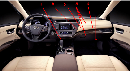
2.Instrument panel shape mimics that of the entry level Prius C, but with much nicer grades of material.
3.Light colored soft looking materials are handsomely contrasted with the obligatory black dash pad.
4.Many different colors here likely make it easy for Toyota engineers and suppliers to avoid the need to precisely match grains, textures, and colors.
5.Dash panel is extremely tall in appearance, similar to the departed Lincoln Town Car.


